Landing pages and product pages often follow a predictable pattern. The headline appears at the top, followed by a value proposition, a call to action, and almost immediately a set of logos, testimonials, or star ratings. The idea behind this layout is simple. Show credibility as early as possible so visitors trust what they see.
But many modern RevOps and conversion teams are experimenting with a different approach. Instead of placing testimonials and logos at the very top, they move social proof below the fold. The reasoning is that visitors should first understand the problem, the solution, and the value before being presented with validation from other customers.
This raises an important question for digital marketing teams and revenue operations leaders:
“If social proof moves below the fold, does conversion drop?”
The short answer is no. In many cases, conversion stays the same or improves. What changes is how and when the proof appears in the buyer journey.
This article explores the psychology behind social proof placement, what experiments reveal about conversion impact, and how teams using platforms like HubSpot can test this approach safely.
Why Social Proof Became a Top-of-Page Default
The reason social proof is usually placed at the top of a page comes from early conversion rate optimization practices. Marketing teams wanted to reduce skepticism immediately.
Visitors landing on a page typically ask three questions very quickly:
- Is this relevant to me
- Can this company solve my problem
- Can I trust them
Logos of recognizable brands, testimonials, and review ratings help answer the third question quickly.
Therefore, many landing page templates include elements such as:
- Customer logos
- G2 or review platform ratings
- Short testimonials
- Usage statistics, such as the number of customers
The assumption behind this layout is that credibility should appear before the visitor scrolls.
However, buyer behavior online has evolved. B2B buyers especially want to understand the solution first before deciding whether credibility signals matter.
What Actually Happens When Visitors Land on a Page
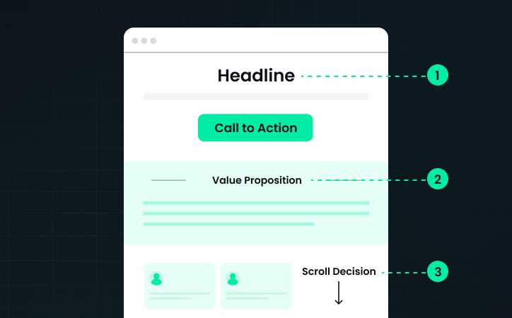
Modern user behavior studies show that most visitors do not read a page line by line. Instead, they scan for meaning.
When someone lands on a page, they usually follow a pattern: first, they read the headline, then look at the supporting description, followed by scanning the page structure, and decide whether to continue.
If social proof appears too early, it may interrupt the logical flow of understanding the offer. For example, imagine a visitor arrives on a page about revenue operations consulting. The headline introduces the service. Immediately below it is a block of logos.
At this point, the visitor might think: "What exactly do they do?"
Without understanding the value proposition yet, the logos does not provide useful context.
When social proof appears after the visitor understands the offer, it becomes much more persuasive. Instead of being a decoration, it becomes confirmation.
The Psychology of Contextual Proof
Social proof works best when it answers a specific moment of doubt. If a visitor has just read about a product feature or service capability, a testimonial reinforces that claim.
For example:
- A section explains how RevOps automation reduces manual reporting
- Immediately below, a customer quote confirms the time savings
- The testimonial now acts as validation.
This concept is often referred to as contextual social proof. The credibility signal appears exactly when the reader needs reassurance.
When placed above the fold without context, proof can feel generic; when placed after a claim, it becomes evidence.
Experiments From Conversion Teams
Several conversion optimization experiments have tested moving social proof further down the page, and the results are interesting. In many cases, conversion did not drop; instead, sometimes it improved.
Here are the most common outcomes reported by CRO teams:
1. Improved Message Clarity
When logos were removed from the top section, the headline and value proposition became easier to understand.
Visitors focused on the core message first. This reduced cognitive load and improved engagement with the rest of the page.
2. Better Story Flow
Landing pages work best when they follow a narrative structure.
Problem > Solution > Benefits > Proof > Call to action
When social proof sits between the headline and explanation, the narrative gets interrupted. And moving proof below the fold restores a natural story flow.
3. Higher Quality Engagement
Visitors who scroll past the first section are already showing interest. Presenting testimonials at that moment reinforces the decision to continue. This often leads to stronger intent when reaching the call to action.
When Moving Social Proof Can Hurt Conversion
While moving proof down the page can work well, it is not always the right approach. In some scenarios, early credibility is still critical, such as:
- The brand is still in its early stages: If a company has low brand recognition, removing logos from the top section may reduce trust. Visitors might leave before discovering the credibility later on the page.
- High-risk purchases: Products involving security, compliance, or financial data often benefit from immediate credibility indicators. Trust must be established early.
- Traffic from cold campaigns: Paid advertising traffic sometimes converts better when credibility signals appear immediately. These visitors often have lower prior awareness. Because of this, teams should treat social proof placement as a testable hypothesis, not a fixed rule.
A Better Framework for Social Proof Placement
Instead of asking whether social proof should appear above or below the fold, a better question is: Where does the visitor need reassurance?
A strong landing page often includes several forms of proof placed throughout the page. Here is a practical structure many high-performing pages follow:
Section 1: Value Proposition
The first section explains the problem and the solution clearly.
Focus on:
- The outcome customers want
- The main benefit of the solution
- A clear call to action
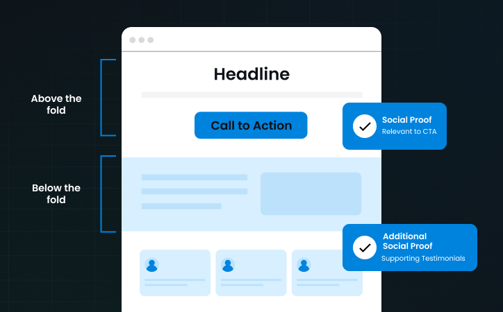
Social proof may appear here in a subtle way, such as a small trust badge or usage statistic.
Section 2: Product or Service Explanation
This section describes how the solution works. Use visuals, short descriptions, or feature highlights. At this point, visitors begin evaluating the credibility of the claims.
Section 3: Social Proof
Now testimonials, case studies, or customer logos appear.
The reader has context and can evaluate whether the proof supports the promise. This placement often performs well because it confirms the story already presented.
Section 4: Conversion Section
The final call to action appears after the proof reinforces the value. Visitors who reach this section are more likely to convert.
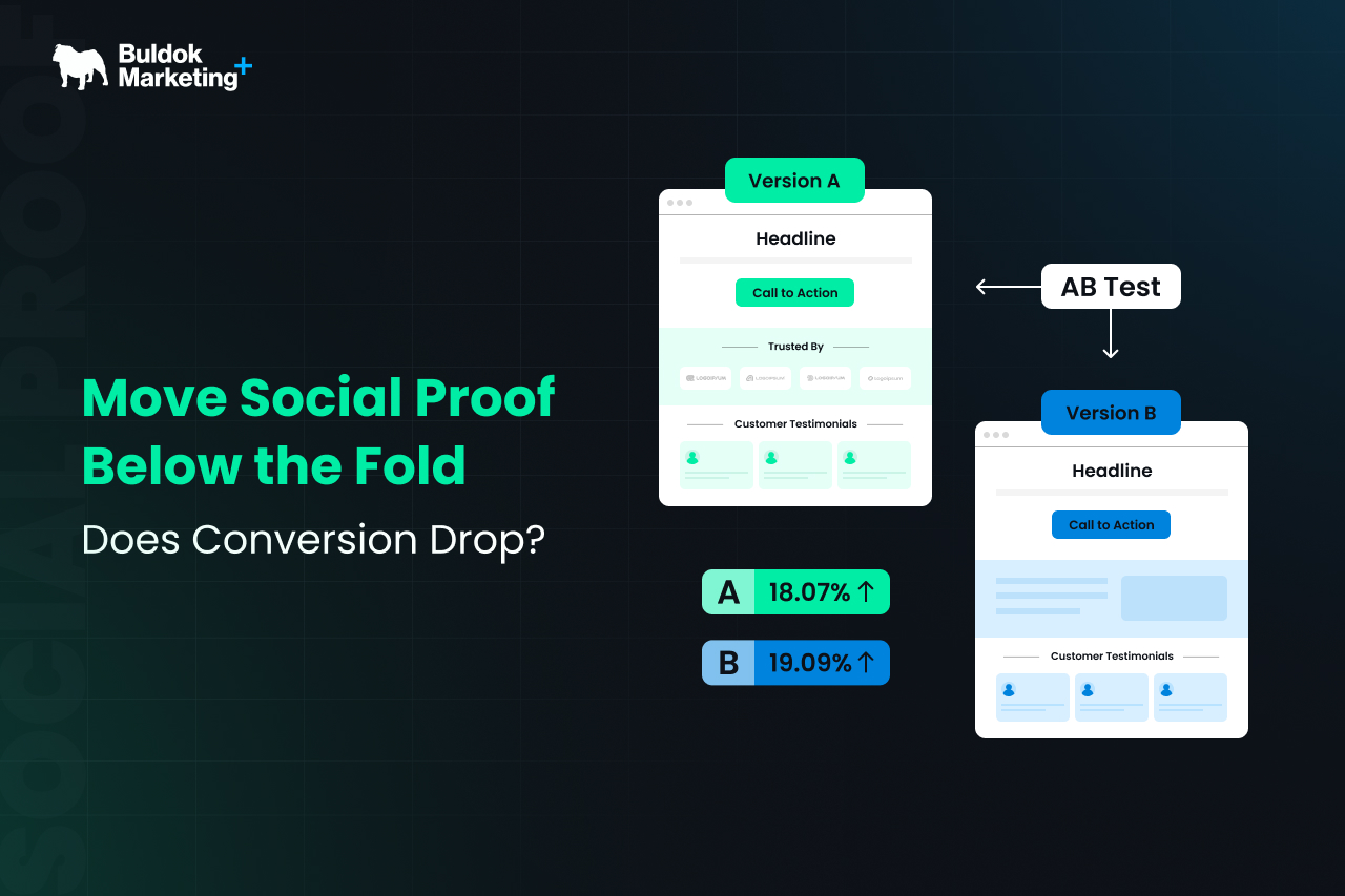
How RevOps Teams Test Social Proof Placement
Testing layout changes is easier today because marketing platforms provide built-in experimentation tools. Teams using a well-set-up HubSpot Marketing Hub can run controlled experiments on landing pages.
A typical testing process includes the following steps:
- Create Two-Page Variations: Version A keeps social proof above the fold. Version B moves testimonials or logos further down the page. Everything else stays the same.
- Run the Experiment With Real Traffic: Traffic from campaigns, search, and email should be evenly split between both versions. The goal is to measure real behavior rather than assumptions.
- Measure Conversion Metrics: Key metrics to monitor include - Form submissions, demo requests, scroll depth, and time on page. These indicators reveal whether visitors engage differently with the layout.
- Analyze Behavior Data: Sometimes conversion rates remain similar, but engagement patterns change. For example, visitors might scroll further before converting. That insight helps refine the page structure further.
This type of experiment is part of a broader RevOps optimization approach, where marketing, sales, and operations teams align around measurable improvements rather than opinions.
Buldok Marketing frequently emphasizes this testing mindset in its RevOps and HubSpot consulting work. Conversion improvements often come from small structural experiments rather than large redesigns.
The Hidden Benefit of Moving Social Proof
There is another advantage to placing testimonials further down the page. It forces marketing teams to improve the actual messaging at the top of the page.
When logos carry too much weight early on, the value proposition may become vague. Removing early proof exposes whether the headline and description truly communicate value.
This often leads teams to improve:
- Headline clarity
- Problem definition
- Outcome messaging
As a result, the entire page becomes stronger.
Examples of Social Proof That Work Below the Fold
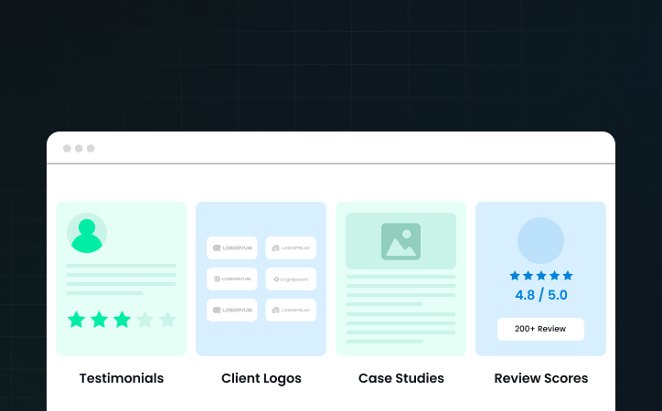
Not all types of social proof behave the same way. Some forms work better earlier, while others perform better once the reader understands the product.
Let’s understand different types of social proofs and where they work best:
- Customer Testimonials: These often work best after a product explanation because the reader understands what the testimonial refers to.
- Case Study Highlights: Short case study summaries showing measurable results work well near the middle of the page.
- Product Review Ratings: Ratings can appear early or later, depending on brand recognition. For well-known products, they reinforce credibility quickly.
- Client Logos: Logos sometimes work well near the top, but they can also appear as a section following the product explanation.
The key is relevance. Proof should validate something the visitor just read.
What This Means for B2B SaaS Landing Pages
For B2B SaaS companies, the buying process involves understanding complex solutions. Visitors rarely convert after seeing a headline and a few logos.
Instead, they want to know: What the product actually does, how it fits into their existing tools, and whether it solves a specific operational problem.
This makes the order of information more important than the presence of proof itself. When the explanation comes first, and validation follows, the message feels logical rather than promotional.
This approach aligns closely with modern inbound marketing principles used by RevOps teams working with platforms like HubSpot. Instead of pushing credibility first, the page builds understanding and then confirms it.
Practical Guidelines for Testing This Strategy
If you want to experiment with moving social proof below the fold, consider these guidelines.
- Start by reviewing the first screen of your landing page.
- Ask whether the visitor immediately understands the problem and the solution.
- If logos dominate the section, the message may be diluted.
- Next, test placing testimonials after the product explanation.
- Look for improvements in scroll depth and engagement.
- Also, evaluate how the page narrative flows. A clear story often performs better than scattered elements.
- Finally, run controlled experiments rather than redesigning everything at once.
Final Verdict
Social proof is powerful because it reduces uncertainty, and the debate about above-the-fold versus below-the-fold placement sometimes misses the bigger point.
What matters most is when uncertainty appears during the reading experience. If visitors doubt your claims after reading about the solution, that is the moment when proof should appear.
When placed strategically, testimonials and logos strengthen the story rather than interrupt it.
So does conversion drop when social proof moves below the fold? Often it does not. In many cases, the page simply becomes more coherent.
And when marketing teams approach the decision through structured experimentation using tools like HubSpot, the answer becomes clear through real data rather than design assumptions.